Impact of New Steel and Aluminium Tariffs Imposed in the US

On February 2, 2018 the US administration announced a new set of tariffs to be applied on imports of steel and aluminium. The tariffs of 25% and 10% respectively will disproportionately affect US’ closest ally and trading partner – Canada. The other countries have relatively manageable exposure to the US imports (see the table below).
Although the event can be applied in Mira either by volume or price impact, we have elected to use the price impact as the key input. Price impact values are derived by weighting the value of exports of steel and aluminium into the US and applying respective tariffs. Only steel has been taken into account in the analysis of countries with small exports of aluminium (Brazil, South Korea, Mexico, Turkey and Japan).

Country % of Imports
Steel
% of Imports
Aluminium
Price Impact US as %
of Exports
Volume Impact
Canada 16% 52% 17% 78% 27.1%
Brazil 13% 0 25% 8% 2.8%
South Korea 10% 0 25% 14% 4.9%
Mexico 9% 0 25% 27% 9.3%
Russia 9% 16% 19% 16% 5.6%
Turkey 7% 0 25% 10% 3.5%
Japan 5% 0 25% 7% 2.6%


A more detailed breakdown of the trade patterns can be found on the MIT OEC website.

Register for Webex: Running The Tariff Stress Scenario in Mira ABM

3 pm Monday, 5 March, 2018

[contact-form-7 id=”1408″ title=”event_subscribe”]
[/one_third]

Risk Scenario: China Disorderly Economic Collapse

Why is The Scenario Risky?

The second largest economy in the world, with reported debt-to-GDP rate of 240% to 280% and a far greater ratio, if shadow banking is taken into account (source: Bloomberg, World Bank), must be a source for concern. More worryingly, the pace of debt build-up is among the fastest in the world: average annual credit growth rate of 20% between 2009 and 2015 was accompanies by GDP growth rate of only 6-7%. “Out of 43 economies where credit-to-GDP ratio increased by more than 30 percentage points within five years, 38 economies subsequently experienced severe disruptions, manifested in financial crises, growth slowdowns, or both.” China’s credit-to-GDP ratio increased by nearly 50%. As long-term risks are too high to bear in the corporate debt market, companies are resorting to short-term funding. The average weight of debt maturing in less than 12 months in total debt among 1020 largest state-owned enterprises (SOEs) is at 66%.

Where Does the Risk Come From?

Debt is not just a result of overly ambitious growth appetite; China’s SOEs have been operating at economic losses for decades – losses that had to be financed somehow.Average Returns on Capital (ROCs) at state-owned enterprises are at 4.5 %. Real market cost of capital is a weighted average of 4-6% on wealth management product yields (the “unregulated level of return”) and cost of equity of 8-10%, i.e. the real cost of funds is near 8%. This means on a $100 investment an average Chinese SOE makes $4-6 and pays $8 as interest, generating a loss of $2-4. Increasing volumes of investment only increase the losses and debt. Only 1 out of 17 SOEs in the CSI index earns more than 8% on capital invested. Cutting investment is not an option due to the political fallback – resulting unemployment and social unrest will be difficult to handle.

The Not So Obvious

Large part of key industries’ balance sheets are supported by property and infrastructure prices. Property prices are supported by more credit. If this demand wanes, balance sheets of companies will look even worse than they are now. Balance sheets of banks are funded by the off-balance-sheet Wealth Management Products (WMPs) – investment instruments sold to clients with implicit guarantee by the bank. Money raised is then used to buy (among other investments) corporate bonds, proceeds of which are used to pay back balance-sheet debt. The mechanism moves debt off the banks’ balance sheets.
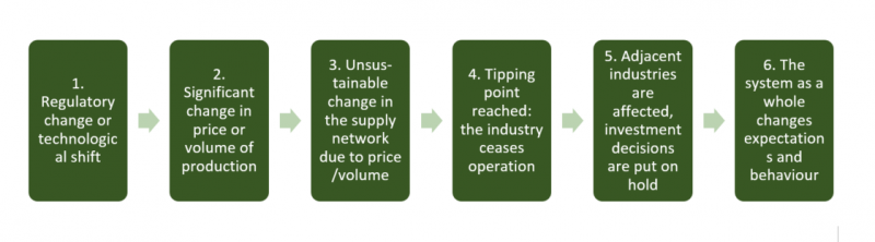
The Initial Impact

Most debt is accumulated in Local Government Finance Vehicles (LGFV’s) and SOE’s, in turn held by banks and structured in WMPs. SOE’s ability to maintain certain level of interest payment is key, which in turn depends on their profitability.Actual interest paid is a bad measure: debt is often rolled over with interest payments capitalized. Many SOEs in reality do not pay interest because they cannot afford to. To determine the industries that are likely to collapse first, we use ROC and size cut-offs. We focus on the least profitable and largest SOEs in China. The scenario assumes a decline in revenues (driven by volumes) of between 10% and 30% – proportional to ROCs and consistent with historical recessions.

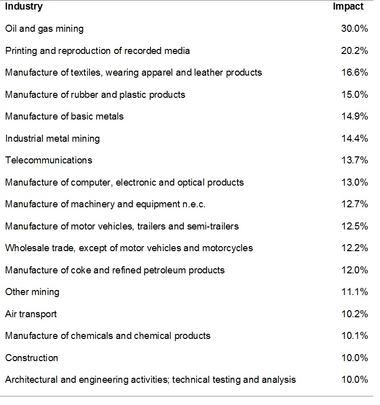
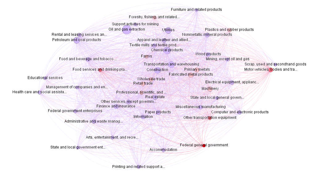
The Contagion Effect

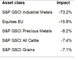
Worst impacted assets are industrial metals at over 70% downside, followed by equities in Europe at nearly 16%.

Safe Assets

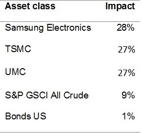
Clearly, US Treasuries are a safe asset to hold in such an event; even though China holds significant reserves of US Treasuries, the demand for Treasuries in this scenario will outweigh the selling pressure from China. A more aggressive hedge against the scenario is a position in electronics and semiconductors manufacturers in Taiwan and Korea. Based on the supply chain analysis LINKS Mira indicates a strong negative relationship between the heavy industries that are part of the weak SEO scenario and advanced electronics and semiconductors: the resulting lower prices for industrial and precious metals are positive for electronics, while the Chinese and global demand for electronics will fall to a lesser extent.
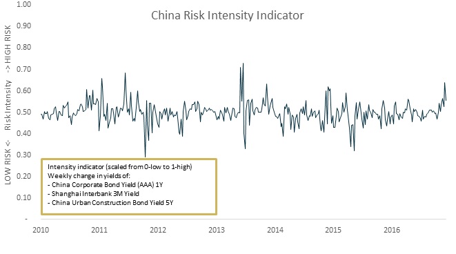
Intensity

Financial risk resides in the bond market, which is observable. The intensity indicator is based on weekly change in yields of three indices representing industrial, interbank and construction markets, with a high risk intensity corresponding with 100 basis point shift in yields in a week – a significant stress in a system.

  • Component 1: China Corporate AAA Bond 1Y yield
  • Component 2: Shanghai Interbank 3M yield
  • Component 3: China Urban Construction Bond 5Y yield

Run Economic and Geo-political Scenarios

Explore how Agent-Based Models (ABMs) can be used to run stress tests and scenario analyses.

Learning From Ninety Years of Recessions: Signs of a New One.

“It took me 30 years to understand that returns are calculated incorrectly. It is always assumed that you survive large events.” Nassim Taleb
As events go, economic crises are the big ones. What makes recessions particularly damaging is our misconceptions about them: there is remarkable lack of agreement among economists and investors about the reasons and anatomy of crises. The biggest culprit is of course our inability to differentiate between the cause, the effect and a coincidence.
In this overview, we use our usual toolkit of supply networks and impact transmissions using our in-house system – LINKS Mira. Our starting point was the NBER United States recessions data – a monthly time series since 1854 where 1 stands for recession and 0 stands for no recession. The NBER recession takes account of a number of monthly indicators—such as employment, personal income, and industrial production as well as quarterly GDP growth. In the end, this too is an arbitrary concept, but the best we have to work with. Since data quality and availability prior to the Great Depression are suspect, we begin the study with the 1929-33 events.
An interesting pattern emerges: all documented crises can be traced back to a significant event that is external to the economic system – usually a major shift in technology (to the extent that technology can be external) or government policy. The external event changes the competitive balance in parts of the supply network. The imbalance grows slowly and after reaching a tipping point where the status quo is not sustainable any longer, explodes and spreads to the adjacent industries.

Network data for recessions

Carry out your own research on recessions data.

Technology shifts in multiple industries were responsible for the Great Depression, the IT bubble and the sub-prime crisis. But by far the most frequent causes of a recession have been regulatory and geopolitical: cutting government appropriations in 1946, introducing accelerated depreciation in 1954, US oil embargo in 1973 – have all caused significant recessions.
This pattern is remarkably similar to what we have today. A large technological shift in the oil industry – the advent of shale oil, creates a temporary glut in the market forcing oil and other commodity prices to shift. This creates change in behaviour: companies assuming low energy prices in the future invest in energy-intensive technologies. At present we are in the phase of multiple tipping points: shale oil and oil services companies cannot operate because of limited capital and cost issues, petrochemical and utility companies have committed significant resources to oil and gas-related projects and oil majors have cut capital expenditure. In this environment it may only take a minor weather-related change in demand to trigger a another event.
Explore the causes and pathways of all ten recessions here.

90 Years of Recessions

Explore the causes and spreading of each of the ten recessions since the Great Depression.

Dissecting the Risk of EM Sovereign Bonds

In a negative yield environment of present days the high single-digit dollar yield of emerging market sovereign bonds is indicative in itself: few believe that the principal will be repaid as debt levels are anything but sustainable. Even before the maturity, any global liquidity event could render these bonds worthless. However for a selective investor the asset class may offer a very interesting yield opportunity with limited debt sustainability and contagion risks.
There have always been plenty of wrong reasons to invest in the financial instruments issued in a collection of countries inappropriately termed emerging markets. To be clear from the onset, these countries have very little in common that would warrant bundling them together, and what is more important, as a group they are not emerging anywhere. Yet, there is at least one good reason to invest in sovereign bonds issued by some of these countries at present – reasonable yields at limited incremental risk. 
What we call reasonable yield is close to 7% for dollar-denominated sovereign paper rated BB and below. Few would argue against the reasonableness of that level given the present environment of negative yields in Europe. A somewhat more difficult argument needs to be constructed to support the assertion of limited added risk. This issue of risk wire expands on the real and perceived risks of investing in dollar-denominated EM sovereign bonds and proposes a controlled implementation process with a custom benchmark. The custom benchmark achieves a level of risk-return combination that is appealing, something that the standard benchmark fails at, particularly once we take into account all aspects of risk.
Key to our argument for limited incremental risk is that past EM crises have one way or another been induced by rising USD interest rates and unsustainable debt levels. In our earlier issues of Risk Wire this year it was demonstrated that yields were very unlikely to rise any time in the foreseeable future.
We get the first hint of the attractiveness of the asset class while comparing valuation/pricing risk across asset classes – the Graham Risk levels (Figure 1). The GR level of -2.7% for EM USD bonds means that there is at least that much yield cushion: given the current macroeconomic risk in these markets the fair compensation for risks is ~4.3% yield instead of the 7%. In other words, an investor in these bonds is overcompensated for the risks.

The Cost of American Industrial Revival

For a number of years investors have been used to the Unites States economy providing almost all of the global growth impetus and serving as a shelter in times of distress in Europe and the Emerging Markets. Abundant capital investment in traditional industries, prompted by low energy prices and the eroding competitive position of China, has triggered a form of U.S. industrial revival. We argue that this revival is temporary and will be followed by painful readjustment, and once again, much like in 2007, the U.S. market will become riskier than the rest of the world.
Cheap natural gas and oil prices in the U.S. combined with rising wages in China heralded the industrial rebirth in the United States during the last few years. Investment in fixed capital, which had collapsed during the great recession, recovered to more sustainable average cross-cycle levels by 2011. What was curious about this recovery, however, was the composition of industries contributing to the net additions to capital stock. While increases in investments in the services industries were still lower than the average over the previous decade, investments in traditional capital and energyintensive industries recovered sharply (Figure 2). Industries like textile, metal fabrication, wood, leather, construction saw fixed asset investments grow at a rate of more than 15% over the decade average, while traditionally growing capex industries saw their investment numbers below average, albeit still significant contributors to the capex growth.

Risk Wire 2016-1: Outdated Expectations in a Changing World

Advances in automation accelerate the trend started by the globalization – higher total factor productivity and GDP growth combined with low incomes and unemployment. As it turns out, our return expectations are not aligned with these realities of today.
Return assumptions for the largest and most liquid asset classes are the key inputs in any asset allocation exercise and consequently pretty much determine the outcomes. The fact that these assumptions are critical and should be carefully examined is now fully acknowledged. It is also understood that these assumptions should be consistent. But consistent with what? The usually taken path is to build expectations consistent with actual history: average historical P/Es and mean reversal assumptions, for instance, can be a basis for calculating expected equity returns. Average yields over the last ten years could help build expectations about the yield levels in the future.
Historical consistency, however, comes at a price. What if historically consistent returns are inconsistent with today’s facts? This is very much the situation we find ourselves today. There have been expectations of rising yields for years now – expectations that have to date caused downfall of illustrious careers. However, yields have remained stubbornly low, even continued to decline. Margins and returns on capital in the U.S. are uncharacteristically and stubbornly high, but so is the unemployment rate (by historic standards at any rate). Making sense out of all this requires consistency not with history, but with today’s realities: the world has changed (as it always does) and expectations should change with it.
One such expectation is higher interest rates – the ever unsuccessful attempt to find that elusive “normal” level of rates. We demonstrate how (and why) yields may continue to fall and sustain even negative levels for a considerably long period of time. Our point of departure is the Graham Risk framework – the cross-asset valuation and risk framework used by LINKS (a complete description and a sample interactive spreadsheet available here).

LINKS Graham Risk Methodology

LINKS Graham Risk based return forecast for European equities and bonds including a complete working model in Excel.

Oil Fatigue: Never Strong Again?

The US economy, in its permanent quest to achieve energy independence, has driven itself into yet another unsustainable state. Counterintuitively, allocating to commodity and oil exporting emerging market equities and debt might just prove to be the winning strategy going forward.
So much of the present investment policy status quo depends on the commodity prices that the implicit assumptions about the current doldrums in the commodity markets continuing for longer period affects long-term asset allocation. Among other things, this assumption has an impact on equity allocation to the emerging markets, high-yield credit allocation in the US, alternatives, infrastructure – you name it, it all depends on what one believes about the commodities, and particularly the oil price.
In our 2011 Global Systemic Risks review we wrote: “…despite higher production (non-OPEC countries) spare capacity in OPEC countries and falling consumption by non-OECD countries the oil price continues to go up. We explain this by the significant impact of the long positions in oil by financial institutions. A further slowdown in the global economy and oil demand will shift the long interest into short interest and cause large price swings. This will dampen the appetite of institutional investors and cause a period of very low oil prices ($20-40 per barrel).”.At the time of course the $ 20-40 range was career-threateningly far from the current price and the anchoring level. That range was eventually breached, partly due to the reasons we expected, and partly due to things that at the time were hard to predict. The drastic change in the oil price level shifted a number of dependencies in the global economy. In this issue of the Risk Wire we assess the supply chain impact of the current low oil prices on the US economy and propose reasons for the unsustainable low-price regime.
Download the paper

Do Pension Funds Know Their Cost of Liquidity?

The conventional wisdom suggests that pension funds have ample liquidity, and therefore can use it to harvest illiquidity premium – excess return due to low liquidity. But while measuring the available excess return by asset class is relatively easy, it is much harder to assess whether that excess return adequately compensates the fund for giving up liquidity. As it happens, the required compensation for giving up liquidity is sufficiently high to rethink asset allocation.
For some time now LINKS have been advocating a more structured and thorough approach to liquidity management at pension funds at the portfolio construction phase. Presently, liquidity is managed at best by holding a certain proportion of the portfolio in the most liquid government paper. Ontario Teachers’ Pension Plan (OTPP) describes the liquidity management with one sentence: “We manage the risk of not having sufficient cash on hand to meet current payments to plan members by holding at least 1.25% of the plan’s assets in unencumbered Canadian treasury bills”. At worst, liquidity management is left to treasury/accounting.
This attitude is not surprising, given the perceived ample liquidity that pension funds possess. Yet, with changes in banking regulation that make long duration assets more expensive, banks turn more and more to pension funds for liquidity provision. Moreover, most asset classes have sub-categories that are less liquid, but promise higher return, such as emerging and frontier markets in equities or high-yield or mortgage-backed securities in the fixed income universe. The question is: just how much excess liquidity does a pension fund have and how much should it be compensated for giving it up? In other words, what is a hurdle rate of liquidity?
To be clear, the answer to this question does not entail estimating the liquidity risk premiums for different asset classes. These estimates are broadly available for most assets however by themselves they do not answer the posed question. Is 1.5% liquidity risk premium of infrastructure investments sufficient to compensate pension funds for locking their cash?

Is Demographics a Threat to Equity Returns?

The U.S. equities by all standards and measures are not dear: both the supply side in terms of sustainable ROEs and the demand side in terms of savings, leverage and inflation shocks are supportive of the current pricing. It is, however, hard to ignore the potential impact of demographics.
A number of years ago the first place we looked to try and explain the historical levels of equity risk premium was demographics. The choice seemed natural at the time: the greater the proportion of older people, the greater the risk aversion and preference for fixed income investments. Despite months of empirical work, however, we failed to find any reliable relationship between the various demographic factors and equity risk premia. LINKS then went on to base the ERP studies on the factors that did exhibit strong empirical relevance: savings rate, leverage and inflation surprises.
As it happens, we did not rid ourselves of the need to think about demographics. As summer of 2015 approaches and the S&P 500 has added a whopping 140% since the low level in 2008 (Figure 1), the question of whether the valuations have become unsustainably high still depends on our understanding of demographics. More specifically, it depends on the elusive link between aging and the savings rate. After all, historically low levels of volatility are yet another reminder of the danger of complacency: the degree of integration of the pro-cyclical nature of volatility with the investment processes of principal investors today is even greater than in 2008.
Download the paper